How do you tell one typeface from another? If you’re trying to distinguish Helvetica from Times Roman, the difference is obvious. In other cases, however – especially between text designs having similar characteristics – the differences can be subtle and difficult for the less–experienced eye to see. One important step in training your eye to notice the details that set one design apart from another is to examine the anatomy of the characters that make up our alphabet.
As in any profession, type designers have a specialized vocabulary to talk about the different parts of letters. It isn’t necessary to commit the entire list to memory, but familiarizing yourself with this terminology will make it easier to communicate about typefaces and their characteristics. It will also help educate your eye to recognize the underlying structure of various designs and the differences among them.
แปล
คุณบอกหนึ่งอักษรจากวิธีการอื่นได้หรือไม่ ถ้าคุณกำลังพยายามที่จะแยกแยะอักษร Helvetica จาก Times โรมันแตกต่างที่เห็นได้ชัดในกรณีอื่นๆ โดยเฉพาะอย่างยิ่งระหว่างการออกแบบข้อความที่มีลักษณะคล้ายกัน ความแตกต่างสามารถจะมีความซับซ้อนและยากสำหรับตาที่มีประสบการณ์น้อยเพื่อดู หนึ่งขั้นตอนที่สำคัญในการฝึกอบรมตาของคุณจะแจ้งให้ทราบรายละเอียดที่ตั้งหนึ่งนอกเหนือจากการออกแบบก็คือการตรวจสอบลักษณะทางกายวิภาคของตัวละครที่ทำขึ้นตัวอักษรของเรา
ในขณะที่สาขาอาชีพใด นักออกแบบประเภทมีคำศัพท์เฉพาะที่จะพูดคุยเกี่ยวกับชิ้นส่วนที่แตกต่างกันของตัวอักษร มันไม่จำเป็นที่จะกระทำรายการทั้งรายการไปหน่วยความจำ แต่ทำความคุ้นเคยกับคำศัพท์นี้จะทำให้มันง่ายต่อการสื่อสารกับรูปแบบอักษรและลักษณะของพวกเขา นอกจากนี้ยังจะช่วยให้ความรู้ที่จะยอมรับตาโครงสร้างพื้นฐานของการออกแบบที่หลากหลายและแตกต่างของคุณในหมู่พวกเขา
ที่มาของภาพhttp://cdncms.fonts.net/images/1dc57858bb6b3569/fontology_anatomy.gif
by Ilene Strizver
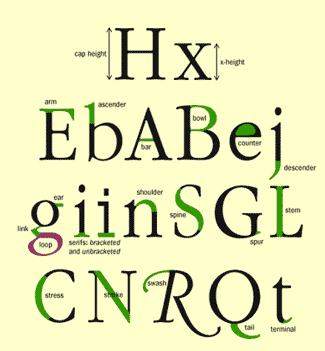
Arm/leg – An upper or lower (horizontal or diagonal) stroke that is attached on one end and free on the other.
แขน/ขา - ตัวอักขระในลักษณะแนวนอนแนวทแยง ที่ติดอยู่บนและล่างของของอักขระและที่อื่นๆ
Ascender – The part of a lowercase character (b, d, f, h, k, l, t) that extends above the x-height.
ครอง - ส่วนเหนือของตัวละครตัวพิมพ์เล็ก (B, D, F, H, K, L, T) ที่ขยายข้างต้น x-height
Bar – The horizontal stroke in characters such as A, H, R, e, and f.
บาร์ - จังหวะแนวนอนในตัวละครเช่น, H, R, E, และ f
Bowl – A curved stroke which creates an enclosed space within a character (the space is then called a counter).
โบว์ - จังหวะโค้งที่สร้างพื้นที่ปิดล้อมภายในของตัวละครอักขระ (ช่องว่างเรียกว่า counter) เช่น e
Cap Height – The height of capital letters from the baseline to the top of caps, most accurately measured on a character with a flat bottom (E, H, I, etc.).
ความสูงครอบ - ความสูงของตัวอักษรทุนจาก baseline ไปด้านบนของหมวก, วัดอย่างถูกต้องที่สุดที่ตัวละครที่มีด้านล่างแบน (E, H, I, ฯลฯ )
Counter – The partially or fully enclosed space within a character.
เคาน์เตอร์ - พื้นที่ปิดล้อมบางส่วนหรือเต็มภายในตัวอักขระDescender – The part of a character (g, j, p, q, y, and sometimes J) that descends below the baseline.
สืบทอด/ช่วงต่อ - ส่วนของตัวละคร (g j, p, q, y, และบางครั้ง J) ที่ลงด้านล่างพื้นฐาน
Ear – The small stroke that projects from the top of the lowercase g.
หูอัขระ - จังหวะขนาดเล็กที่โครงการจากด้านบนของตัวพิมพ์เล็ก เช่น g.
Link – The stroke that connects the top and bottom part (bowl and loop) of a two–story lowercase g.
เชื่อมต่อ - จังหวะที่เชื่อมต่อส่วนบนและด้านล่าง (ชามและห่วง) ของตัวพิมพ์เล็ก g. สองชั้น
Loop – The lower portion of the lowercase g.
ห่วง - ส่วนล่างของตัวพิมพ์เล็ก g.
Serif – The projections extending off the main strokes of the characters of serif typefaces. Serifs come in two styles: bracketed and unbracketed. Brackets are the supportive curves which connect the serif to the stroke. Unbracketed serifs are attached sharply, and usually at 90 degree angles.
เส้นขวางตัวอัขระ - ประมาณการการขยายออกจังหวะหลักของตัวละครของรูปแบบอักษรสองรูปแบบ: วงเล็บและ วงเล็บเป็นเส้นโค้งที่เชื่อมต่อสนับสนุนจังหวะแนบอย่างรวดเร็วและมักจะอยู่ที่ 90 องศามุม
Shoulder – The curved stroke of the h, m, n.
ไหล่อักขระ - จังหวะโค้งของ h, m, n
Spine – The main curved stroke of the S.
กระดูกสันหลัง - จังหวะโค้งหลักของตัว S.
Spur – A small projection off a main stroke found on many capital Gs.
ปลาย - ตัว A ขนาดเล็กออกฉายจังหวะหลักที่พบในหลายตัวอักษร Gs.
Stem – A straight vertical stroke (or the main straight diagonal stroke in a letter which has no verticals).
ต้นกำเนิด - ตัว A จังหวะแนวตั้งตรง (หรือหลักจังหวะขวางตรงในรูปซึ่งมีแนวไม่มี)
Stress – The direction of thickening in a curved stroke.
ความเครียด - ทิศทางของความหนาในจังหวะโค้ง
Stroke – A straight or curved line.
จังหวะ - เส้นตรงหรือเส้นโค้ง
Swash – A fancy flourish replacing a terminal or serif.
ซัด - แฟนซีแทนที่ขั้วต่อหรือปลายขั้ว
Tail – The descender of a Q or short diagonal stroke of an R.
หาง - สืบทอดของ Q หรือทแยงมุมสั้นของอาร์
Terminal – The end of a stroke not terminated with a serif.
ปลายทาง - ปลายตัวอักษรไม่ได้สิ้นสุดลงด้วย serif.
X-height – The height of lowercase letters, specifically the lowercase x, not including ascenders and descenders.
X-height - ความสูงของตัวอักษรตัวพิมพ์เล็กโดยเฉพาะ x ตัวพิมพ์เล็กไม่รวม ascenders และ descenders อ้างอิงจาก
http://www.fonts.com/content/learning/fontology/level-1/type-anatomy/anatomy
เรียบเรียงคำแปลโดย ณัฐพงษ์ วิริยาธนวัฒน์
ไม่มีความคิดเห็น:
แสดงความคิดเห็น